


 |
Phil Davis
 |
Including non-BTZS work in the gallery is an
unusual exception to the guide lines and I hope it won't establish a
free-for-all precedent. But I've received a request to show some of my
alternative process photographs here and a few of them are in color. I can't
even claim that the original negatives were made with BTZS methods because
most of this work pre-dates BTZS by quite a few years.
I was attracted to historic printing processes in the mid-1950s and
researched them fairly seriously until about 1970 (when the BTZS concept
began to divert my attention). After dabbling in a lot of strange methods I
narrowed the field down to 3 favorites: Gum Dichromate, Photogravure, and
Platinum/Palladium. My all-time favorite was, and still is, Gum; partly
because I enjoy working with fine papers and pigment, partly because
producing a color Gum print that approaches photographic quality is a
devilishly difficult challenge (which narrows the field considerably), and
partly because I think the image quality is beautiful. But I confess I'm not
really very good at it; probably no more than 1% of my attempts are
"keepers."
I admire the traditional sheet-fed gravure process for its extremely rich,
velvety shadows and subtle gradations. It's also a difficult and
craft-intensive process and now the essential materials are almost
impossible to find. Although there are modern substitutes that work well
they don't appeal to me for some reason, and I've disposed of my Gravure
equipment. The bulk of my work with Gravure was portraiture.
Platinum/palladium printing is now probably the most popular of the
alternative processes for several reasons. It's quite easy, the materials
are readily available, and the images can be quite beautiful.
Platinum/palladium is also relatively predictable and controllable so it's
possible to calibrate it quite successfully using sensitometric methods.
Sensitometry is useful in Gravure, too, but Gum is untamable; I don't
believe it's possible to make two identical color Gum prints, at least I
know I can't.
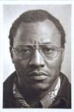
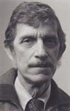
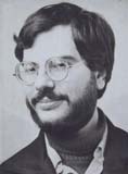
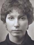
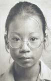
The portraits of Carroll, Harvith, Hinton, and Cheng are gravure, printed
from contact positives from the original 8x10 negatives. I used a variety of
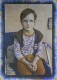
ink colors, mostly browns, in this portrait series. The color prints of
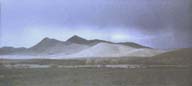
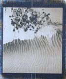
Liesfeld, Tim, and Thunderstorm are 3-color Gum from 35mm slides; the Dunes
print uses only two colors, Burnt Sienna and Prussian Blue, and is from a
2-1/4 square transparency.
The Palazzola portrait is a pt/pd mixture on Hayle paper. Like the other
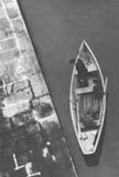
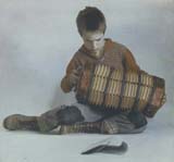
portraits, it's from an 8x10 B&W original negative. The Boat print is
straight platinum on RWS watercolor paper. It was printed from an enlarged
negative made from a Hasselblad original.
|