*Toe Twiddling For BTZS Film Testers
by Phil Davis
I’ve received a few questions recently referring to my recent article
about the “Personal Speed Point” and how one goes about establishing it.
I haven’t heard of any serious problems, in fact most folks seem to be making
good progress. But, as usual, there are reports of some minor irregularities
in the test files, especially in the contours of the Chart lines.
These
lumpy lines may look a lot more serious than they are because, in the case
of the EFS charts in particular, the errant data points are rounded up or
down, in use, to coincide with the standard film speed numbers. For example,
any chart value between 90 and 112 will automatically become 100, when applied
to a meter.
At least that’s the way we used to think about it until the ExpoDev program
came along. Now, however, EFS and G-bar (average gradient) numbers are exported
to the ExpoDev without being rounded; in other words, the program interpolates
intermediate numbers, and delays rounding until the computation is finished.
Given the uncertain nature of the whole photographic process, we can’t really
make a case for the greater “accuracy” of this calculation method, but it
does recognize the fact that a minor change in exposure doesn’t result in
an erratic, disproportionately abrupt change in the negative’s image density;
nor does contrast increase in spasmodic leaps as development time advances,
second by second.
Recognizing this smooth progression of exposure and development effects
is an especially important concern now that the ExpoDev program displays
actual development times. These times are discovered by a magical function
that tracks the Dev Chart lines and reads off their time and density coordinates,
not just at the 21 data points, but at any selected point along the line’s
length. If these lines are irregular or lumpy, the development times read
from them will be similarly irregular.
The G-bar and Dev Chart lines are plotted directly from the data points
of the Family curves, so it’s obvious that any irregularity in the Family
display — especially in the critical toe region — will deform the Chart
lines and distort their information.
We can’t correct erratic Chart lines directly but we can (and should)
edit them indirectly by cleaning up the Family curves. In the Family Tab,
select the arrowhead pointer from the tool bar and the data points on all
of the curves will be identified by small circles. Click on a circle to
select it and you will then be able to step along the curve in either direction
by using the right and left arrow keys. You can jump from curve to curve
with the up and down arrow keys; and you can move any point up or down,
one pixel at a time, by holding down the shift key as you use the up or
down arrow keys. Moving the data points will also change their density values
in the Data Tab just as if you had edited the numbers directly.
Of course you should use this powerful editing feature discreetly because
it’s quite possible to create fictitious curve contours this way. But when
applied sensibly, these point adjustments can actually improve the accuracy
of your test data. Point density errors of 0.01 or 0.02 are entirely possible
because the density of any film sample can sometimes vary by that much if
the readings are taken from slightly different areas. Also, densitometers’
accuracy is generally no better than +/- 0.01 and their zero settings can
drift by a similar amount. In other words, you can expect to discover a
few points out of place no matter how carefully you work. In the interest
of good craftsmanship — and good data — you should correct them as well
as you can.
First, check the curves visually to discover random displaced points,
and if the correct location of a point is obvious, nudge it into place with
the arrow keys. Then pay particular attention to the toe region of the curve
family because even slight irregularities there can skew the chart lines
significantly. In other words, if you see a bent or jagged chart line, check
the curve toes first because that’s where you’re likely to find the cause
of the problem.
Analyze the situation before you begin to shift data points around; the
first editing principle is “do no harm.” At first glance there may appear
to be several ways to correct toe deformities, but the scheme that requires
the fewest moves is probably the best one. It’s also a good idea to assume,
at first, that unless these are obvious displacements, the extreme curves,
1 and 5, are probably OK. Then look for abnormal variations in the spacing
between curves; the spaces should converge smoothly as they approach the
toe region and the curves should never touch each other, at least not until
they level out at the B+F density level.
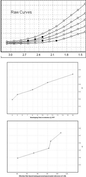
For an example of successful “toe twiddling” look at the “Raw Curves”
illustration which shows the original toe configuration of a test file,
as well as its G/Dev and G/EFS charts. Superficially it appears that curve
2 needs adjusting to fix the G/Dev chart, but curve 3 seems to be the cause
of the break in the G/EFS chart. Actually curve 2 had a different problem
that I’ll explain later.
 |
Raw Curves
|
At first glance at the curve family I could see that there was a single
point out of place on curve 1 and also on curve 2 (the errant points are
shown in black). Moving each of them up by one pixel improved the chart
lines a little, but the break in the G/EFS chart line was unaffected. Taking
a longer look at the toes, I decided that curve 4, not curve 3, was the
troublesome one because of the uneven spaces between it and the adjacent
curves. Curves 4 and 5 were almost parallel for a little distance, while
the space between 3 and 4 converged sharply. In other words, three points
on curve 4 needed to be raised up by only one pixel each. Making that adjustment
produced the result shown in the “Fixed Curves” illustration. Interestingly,
it turned out that points 3 and 5 were the valid ones; the point adjustment
I made affected the other three points to produce the smooth EFS chart line.
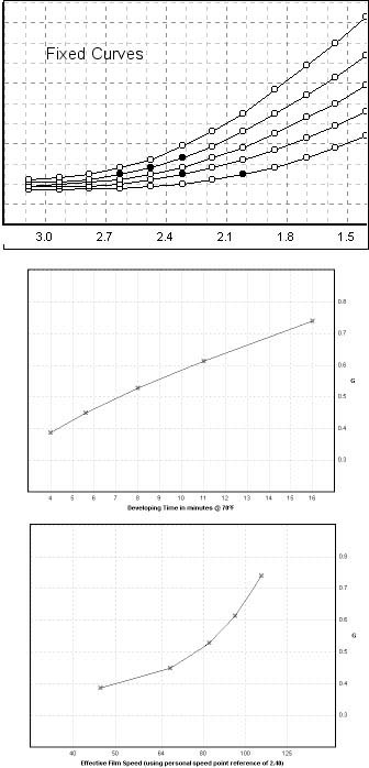 |
Fixed Curves
|
These adjustments are largely cosmetic and they have relatively little
practical affect on the accuracy of the working data exported to the Palm
and iPaq hand-held devices. But the corrected lines are theoretically more
accurate, and as long as we have the option of doing things right, we might
as well make the effort.
The initial hump in the G chart line (point 2) turned out to be a data
entry error. The developing time for that point had been entered as “5mins
40s” and that entry baffled the WinPlotter; it assumed that the “5” was
the last significant number, and ignored the following “mins 40s.” When
that labeling error was corrected the final G/Dev chart line was commendably
smooth. To avoid this sort of error, enter these times either as decimals
(5.6mins) or in the conventional minute:second format (5:40). The Plotter
stops paying attention to these numbers as soon as it encounters an alphabetic
character.
*Title suggested by Bill Waldron; he dared
me to use it. Heck, I don’t have any pride.
|