![]()
![]()
       |
How to read a film test
|
||||||||||||||||||||||||||||||||||
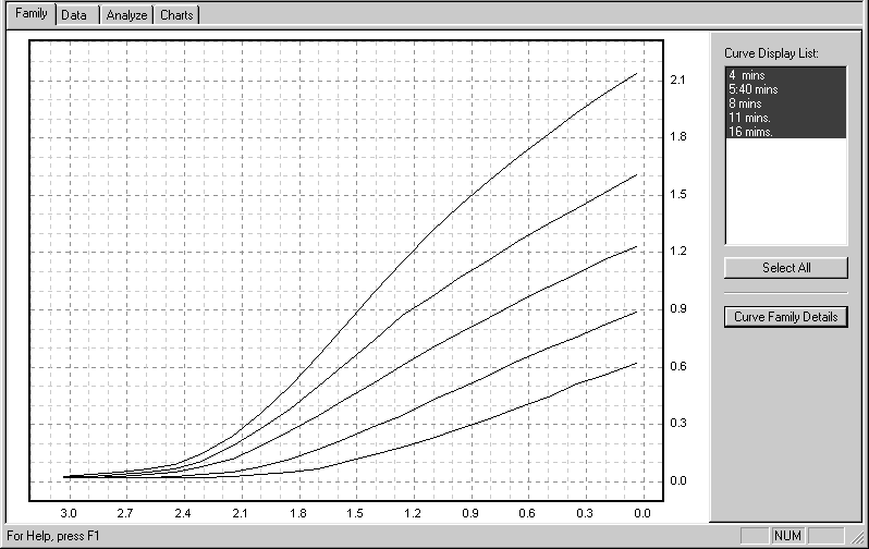 |
Figure 1 |
Film exposure values are represented by the step tablet densities displayed along the horizontal axis (x-axis) of the graph. Although these densities increase from right to left, the exposures they represent increase from left to right. Each interval of 0.3 is equivalent to a stop, so the total numbered exposure range, from 0.0 to 3.0, is equivalent to 10 stops. The density range of a developed film is indicated by the numbers on the vertical axis (y-axis) of the graph. Each interval of 0.3 stands for one stop, and density values increase from bottom to top.
There are several important points marked on each curve. “B+F” refers to the density of the film base plus fog; it is also sometimes referred to as “Dmin” or minimum density. “Emin” and “Emax” define the minimum and maximum limits of the test image’s exposure range. This corresponds with the subject luminance range (SBR) of a real pictorial negative. “IDmin” and “IDmax” identify the minimum and maximum image densities; and the difference between them, along the y-axis, is the density range (DR) of the negative image. The slope of the curve between IDmin and IDmax is averaged to provide the average gradient or “G-bar” also abbreviated sometimes as “Av. Grad” or “Avg. G.” It is a precise indicator of development extent.
The test statistics (test date; film type and size; ISO; developer type, dilution, temperature, and volume; agitation method; and notes) are listed in the Plotter’s “Family Details” window, figure 2. Descriptive information about the individual film curves is displayed in the upper left corner of the curve windows.
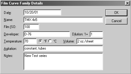 |
Figure 2 |
Next the Plotter analyzes the curve family, locating its speed point, and calculating all the subject ranges (SBRs) and effective film speeds (EFS values) based on the assumption that you’ll print on “normal” grade #2 paper with an exposure scale (ES) value of 1.05, figure 3. If you plan to print on a different grade, or use a different contrast printing filter, let us know; and tell us what printing method you use (contact, condenser projection, diffusion projection, etc.) so we can give the Plotter an appropriate ES value to use in the analysis. The ES number represents the exposure range that the paper needs to produce a full-scale print so, in effect, it defines the density range (DR) of the negative that the paper prefers to work with.
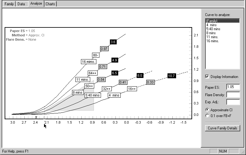 |
Figure 3 |
The Plotter determines working film speeds (EFS values) in a 2-step process: First it locates within the family a curve whose average gradient (G-bar) of approximately 0.62 satisfies the ISO/ANSI film speed standard. It then identifies that curve’s speed point on the horizontal axis of the graph as the rated ISO speed of the material, assigned by its manufacturer. This “official” ISO point appears on the x-axis as a small gray circle. Unfortunately, not all films live up to their ratings, so we provide a special reference speed point, identified by a dark circle/triangle that represents the “real” ISO point of the material. The Plotter compares these two points to determine the practical working speed of the film/developer combination for any subject range and development condition. Similarly, the program uses your ES value and the curves’ G-bars to calculate the subject ranges.
These data are presented in chart form, plotting effective film speed and development time against average gradient, subject range, and N-numbers. The six charts are: Dev.Time/SBR, Dev.Time/G, Dev.Time/N (figures 4, 5, and 6); and EFS/SBR, EFS/G, and EFS/N (figures 7, 8, and 9). The film speed information in each of the EFS charts is the same, as is the developing time in the Dev.Time charts. It’s simply presented in different forms for your convenience.
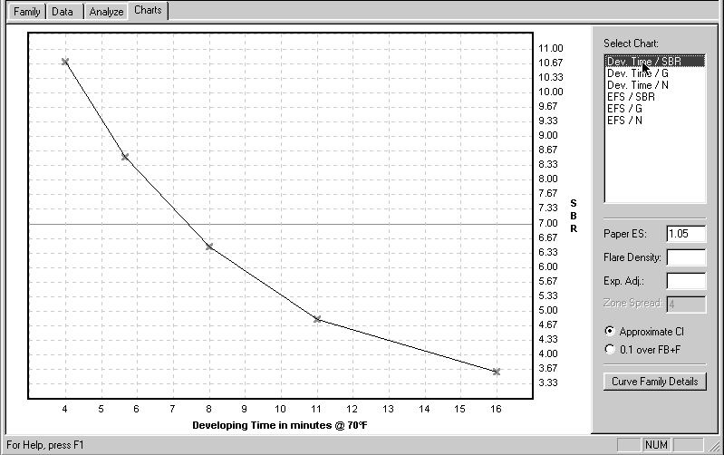 |
Figure 4 |
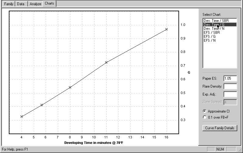 |
Figure 5 |
 |
Figure 6 |
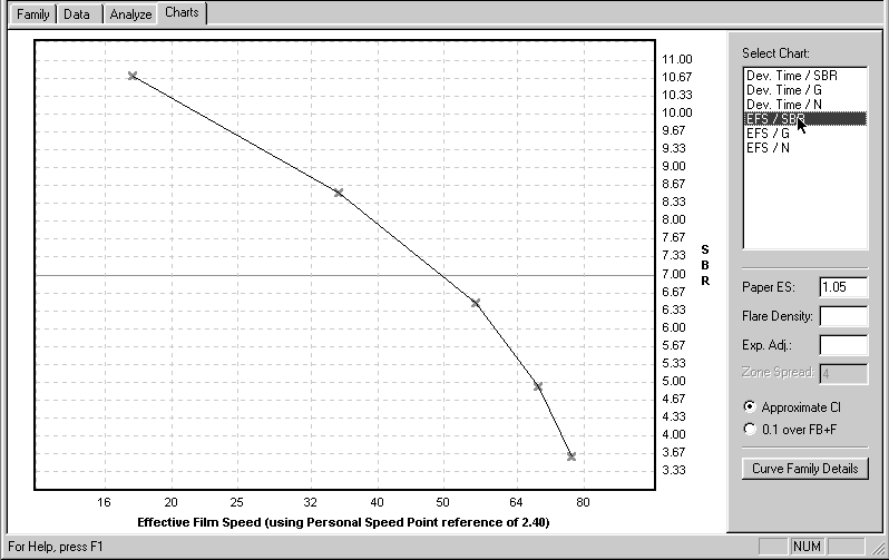 |
Figure 7 |
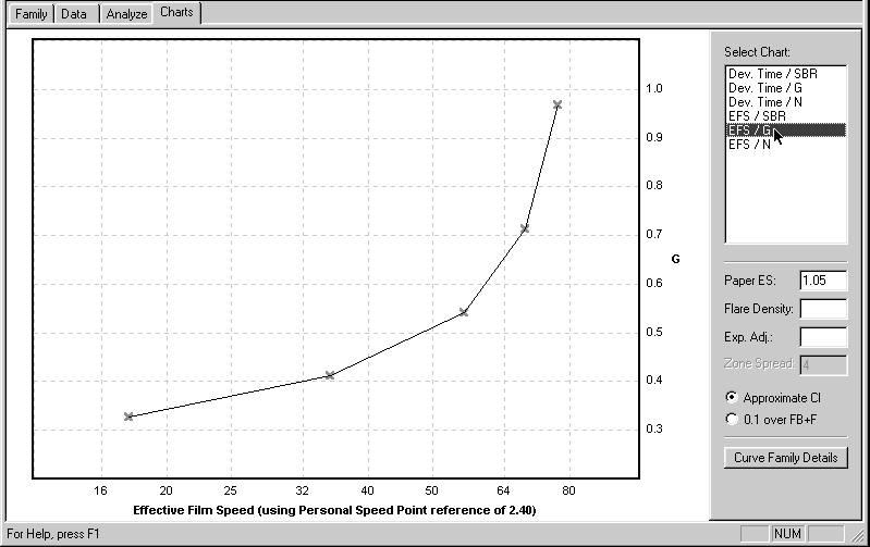 |
Figure 7 |
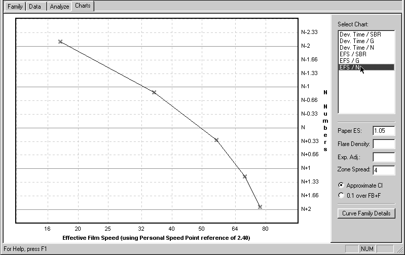 |
Figure 9 |
These charts display the basic working characteristics of your materials themselves, unrelated to camera use; that is, they do not contain any compensation for either flare or reciprocity effects. If you use either of the BTZS exposure/development aids — the PowerDial or the ExpoDev program in either the Palm or WinCE handheld computers — you should use the information from these first charts because the BTZS devices have their own built-in compensation for flare and reciprocity.
It’s also possible to use the chart information “manually,” that is, with your meter alone. If you prefer to work that way you should work with charts that contain some flare compensation, figures 10 through 15. You’ll have to calculate reciprocity compensation yourself because there’s none included in these chart data.
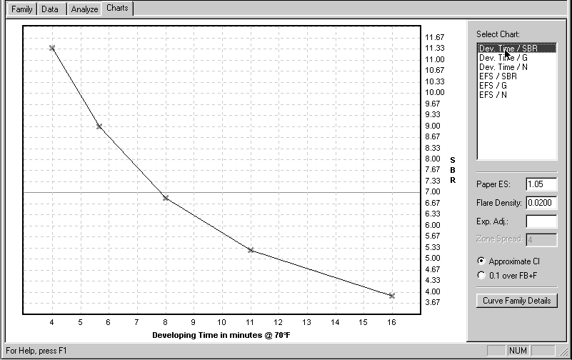 |
Figure 10 |
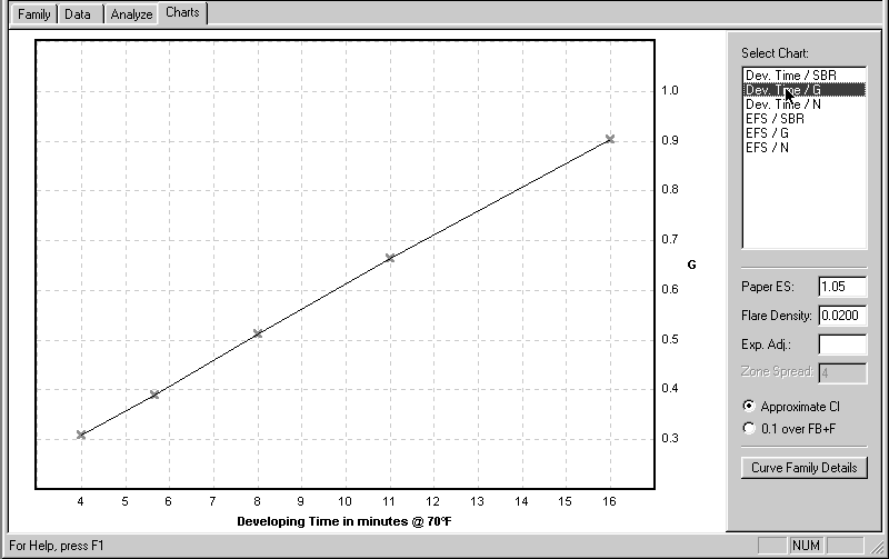 |
Figure 11 |
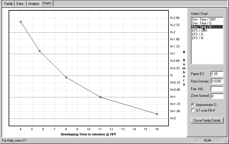 |
Figure 12 |
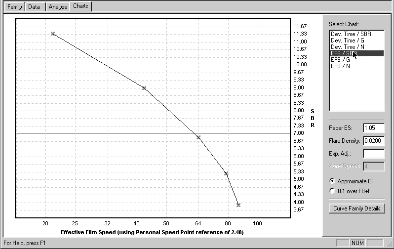 |
Figure 13 |
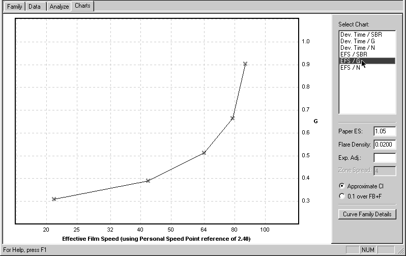 |
Figure 14 |
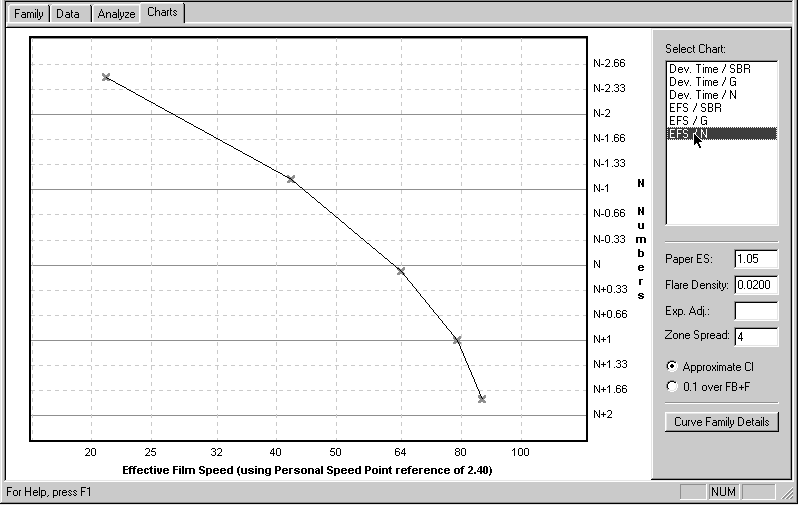 |
Figure 15 |
Flare is an inevitable influence in any photograph and its effects usually
include an increase in image density, and a reduction in contrast, especially
in the shadow areas. There may also be a slight increase in effective film
speed. The amount of flare compensation included in these data is a reasonable
average value. It will not be ideal for all subject conditions, but neither
would any other single value. At least it’s a step in the right direction
and it will probably be satisfactory for the majority of subjects.
You
can see these flare effects graphically by comparing a “normal” curve, figure
16, with a “flared” curve, figure 17. Notice the increased B+F density,
the reduced contrast (Avg. G), the extended toe contour (reduced shadow
contrast), and the slight speed increase. The “flared” chart data include
compensation for these effects. Again, use these “flared” chart data only
if you’re working manually.
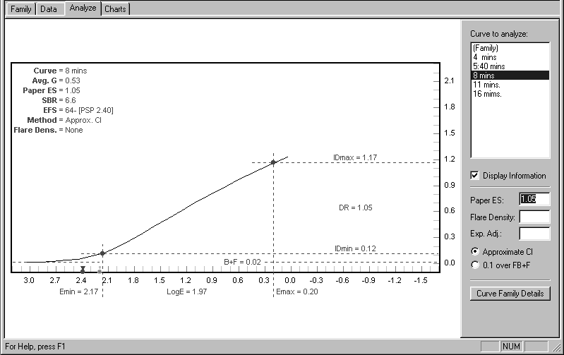 |
Figure 16 |
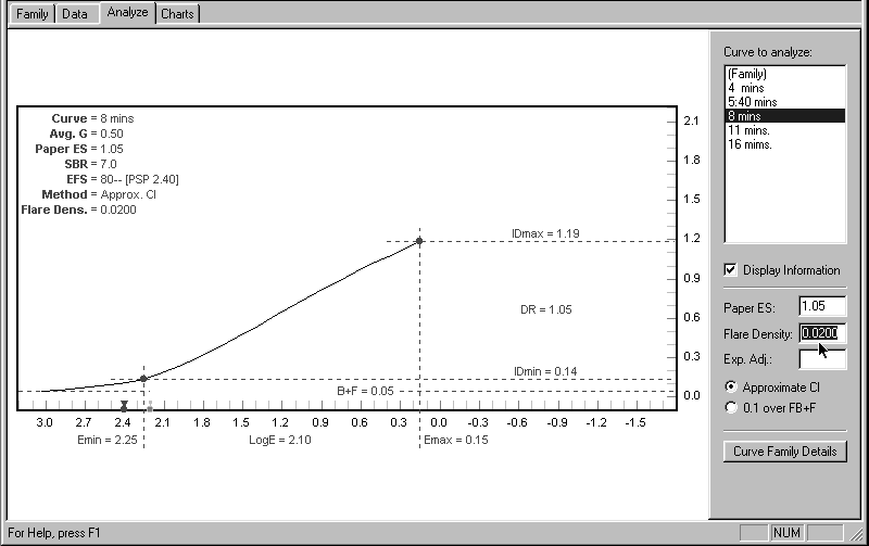 |
Figure 17 |
If you are using the latest version of the WinPlotter and working with
either a Palm or PocketPC handheld in the field, you can upload the (“unflared!”)
Plotter chart data directly into your handheld device and dispense with
the charts themselves. There are at least two advantages in doing this:
first, the working data can be derived from your personal tests; and second,
you can include specific reciprocity compensation for any of the film/dev
combinations in the Plotter’s extensive database. This packs all of the
essential information and calculation into the handheld device, freeing
your mind from technical concerns so you can concentrate on the selection
and personal interpretation of subject matter—which, after all, is the whole
point of large-format B&W photography.
© 2002 Phil Davis